What can I track in Google Analytics 4?
You can track flipbooks you create with FlippingBook Publisher and FlippingBook Online with Google Analytics. Both products support the latest version of Google Analytics, GA4. Google Analytics is a powerful tool with lots of possibilities. It also has a steep learning curve.
This tutorial is aimed at users who have little experience with GA or have previously used Google's Universal Analytics (UA). We will show the most common operations that should get you started with GA4 in general. We use the most common stats for your flipbooks as examples.
💡TipGoogle Analytics is available in all Publisher editions and FlippingBook Online starting with the Optimal plan. If you have little GA experience and use FlippingBook Online, then we would first advise you to have a look at our built-in stats. It has a much lower learning curve and requires no setup!
Note that before you can see any meaningful data:
- You should first create your GA4 property (learn how for FlippingBook Online or FlippingBook Publisher)
- Add your Measurement ID to your publications and reupload them if you use FlippingBook Publisher
- Wait around 24 hours before your stats become visible in your GA reports.
If you have just added your GA4 Measurement ID, then we advise you to open a flipbook and click around a bit to generate some test traffic. You can verify is everything is working correctly in the Real-time report. Click on the Reports icon and select Real-time:
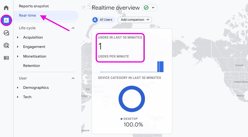
If you see that this traffic shows up, your GA account is set up correctly. You can then check the actual reports tomorrow.
This article will help you find out the following information about your flipbooks:
- How many views did my flipbooks get?
- How to see individual views per page?
- How do my visitors reach my flipbooks?
- How successful were my campaigns?
- From which countries, regions, and cities did my viewers come?
- How many visitors were new, and who visited my flipbooks before?
- Which links in your flipbook were clicked?
- What devices did my visitors use?
How many views did my flipbooks get?
The most obvious statistic is “how often were my flipbooks viewed”. To see that:
- Go to Reports.
- Set the Date interval for the period you are interested in.
- Go to Life cycle > Engagement > Pages and Screens.
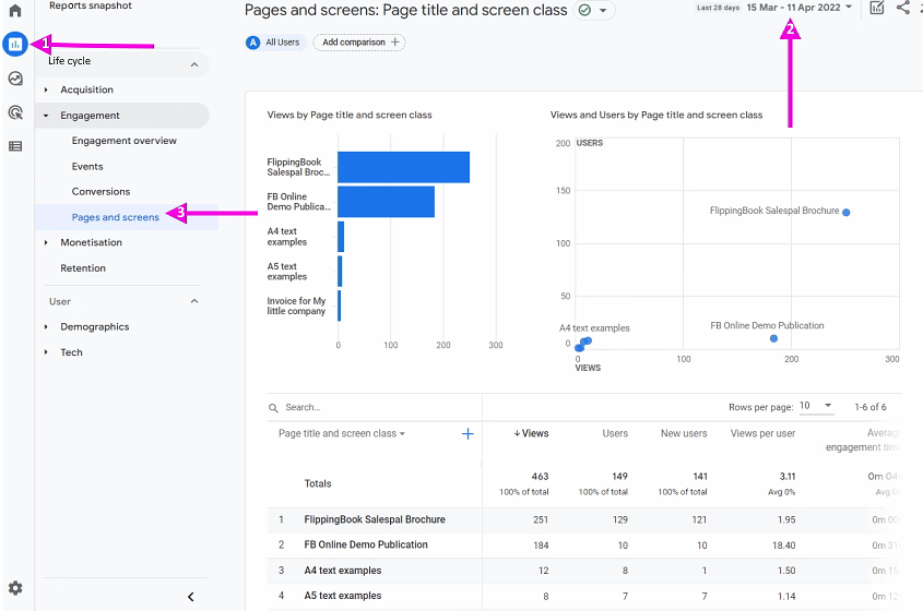
You will see a bar chart that shows the number of all page views that your flipbooks received. That is not the same as the number of people who opened your flipbook. GA is designed for web pages, so by default, it shows the number of page views of all pages in our flipbook combined. We are often at least as interested in the number of users who looked at our flipbooks in general, regardless of how many pages they looked at.
This data is present in the table with flipbook details: After the name and the total number of pages views, you’ll find the total number of users that viewed your books. The next column shows how many of those are new users. The table also shows how long the average user was engaged (i.e. looking) at your book.
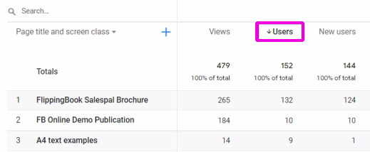
You can click on Users to sort the table with flipbooks by the number of users who visited your books. An arrow will appear to indicate that your results are sorted on this metric now.
Some users visit your flipbooks more than once. To see the number of times that your flipbook was opened, look further down the right in the table. You'll find a column 'Event count' with a default selection of 'All events'. If you change 'All events' to 'opened', you'll see how often your flipbooks were opened. 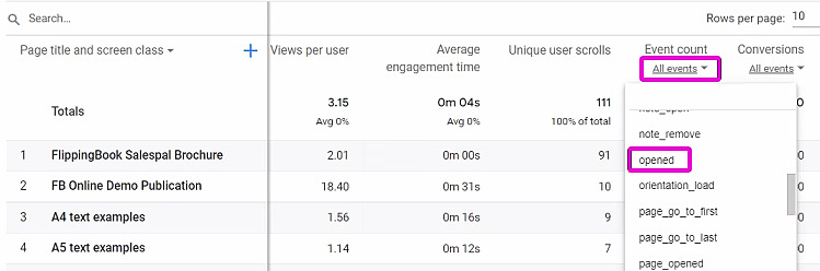
How to see individual views per page?
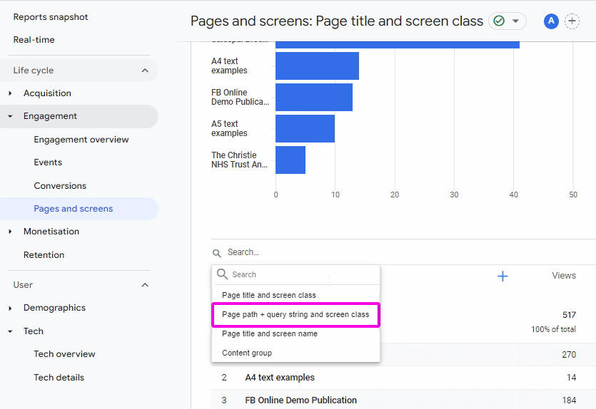
To see how many views every individual page received, use the same steps as above, but change the first column to Page path + query string and screen class.
If you track multiple flipbooks with your Measurement ID, the results become unclear quickly. To see only the pages for a specific flipbook, you can type (a part of) the URL name in the Search field and press Enter. This way, you can filter out all pages with the URL for a specific flipbook.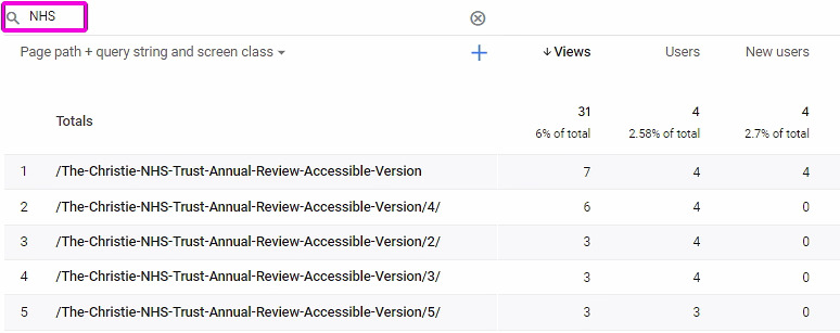
You can change the sorting order to the path by clicking in the area around Page path + query string and screen class. While this makes things a bit better, the URLs with the page numbers are unfortunately sorted as strings. That means that pages 10-13 show up above pages 2,3,4, etc.
You can export all data to a CSV file, so you can reorder and analyze your data further in e.g. Excel or Google Sheets. To do that: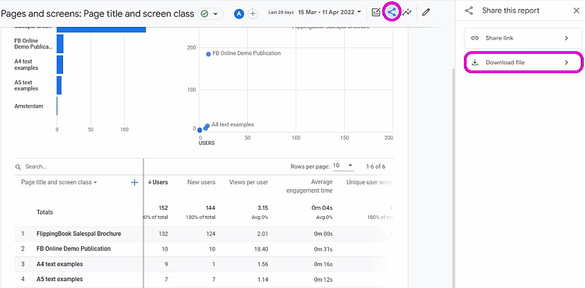
- Press the Share icon.
- Select Download File.
- Select Download CSV.
The CSV file will now be downloaded to your standard download folder.
How do my visitors reach my flipbooks?
In the section Life Cycle > Acquisition > Traffic acquisition, you can find a report of how your visitors reached your flipbooks.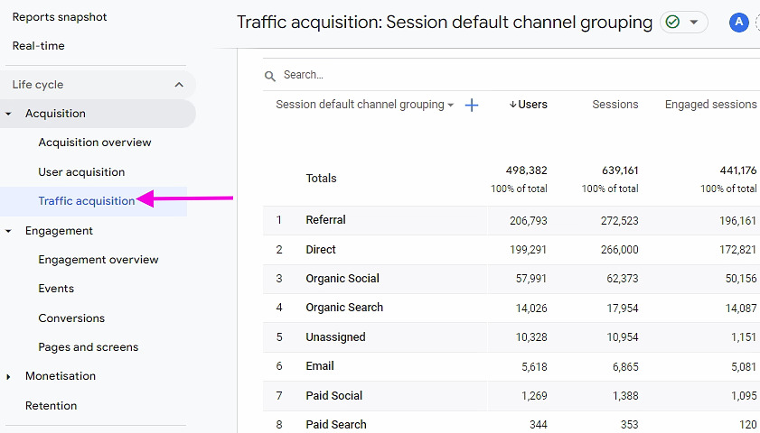
- Referral means they clicked on a link on another page that led to your flipbook.
- Organic Search or Paid Search means they used a search engine, Organic Social or Paid Social means they found it on social media.
- Email means, of course, that your visitor opened your flipbook after a link from an email. Unfortunately, not all email clicks are automatically grouped under this category! Therefore, we advise you to use UTM parameters in your links when sharing them through email.
- Direct pretty much means 'for any other reason'. It could be because the flipbook is embedded into another page, the reader typed the URL, bookmarked it, opened it from some app or document, or from an instant message.
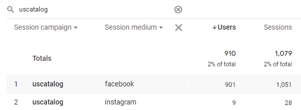
What if you are not interested in the general acquisition picture for all flipbooks, but in a specific one? To see that we will break down our standard report and add a secondary dimension.
- Go to the Engagement > Pages and Screens report.
- In this example, we want to see how people got to our Salespal Brochure. Therefore, we filter the list by typing ‘brochure’ in the Search field and pressing Enter. We now see that 130 users visited that brochure.
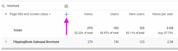
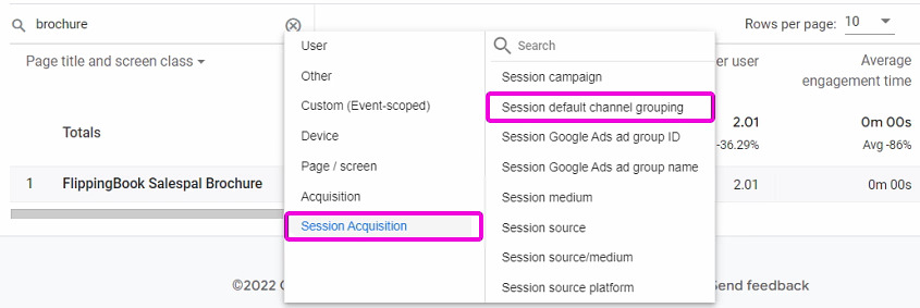
- Now, we click on the Plus sign. This adds a secondary dimension to your report. This breaks down the first column’s data in more detail. We are interested in the Session Acquisition > Session default channel grouping.
- After we selected this, we now see how these 130 people got to our brochure: 126 got there ‘directly’, and 4 because they clicked a link on another page to this flipbook.
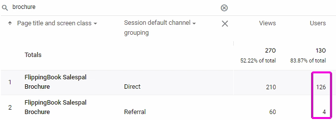
Since this flipbook is embedded into another webpage, it is not surprising that so many visits are marked as ‘Direct’. The page where we embedded this flipbook into is the main way of sharing it.
How successful were my campaigns?
You can add UTM parameters to flipbook links when you use them in marketing campaigns. The most common ones are the
- utm_campaign: the name of your campaign, such as product-launch, back-to-school, black-friday. You can use a single campaign to promote across different channels.
- utm_source: the website or platform that the visitor came from e.g. google, facebook, mailchimp or the name of the site you advertised on.
- utm_medium: the type of channel that you communicate over: social, email, banner, cpc
If you added information like this, you can analyze the effectiveness of your campaign by changing e.g., the first column to Session campaign, and adding a second column to break down by medium.
From which countries, regions, and cities did my viewers come?
You can see a heatmap of countries for all visitors in User > Demographics > Demographics overview.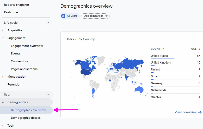
This may be enough if all you want to know is the general geographical distribution of all visitors for all your flipbooks. For a closer look, the tab with Demographic details is more interesting.
At first, it looks like the same data, only in a table. But you can break it down by adding a second column, just like we broke down acquisition data in the previous paragraph. If you want to know the detailed geographical distribution of a specific flipbook, you can
- Click on the Plus sign to add a second column.
- Now, select Page / Screen > Landing page from the dropdown list.
- Enter the identifying part of the URL of your flipbook in the search field and press Enter. In this example, we search for 'Demo'.
- When done, change the second column from Landing page to Region. We are now looking at the visitor distribution per state
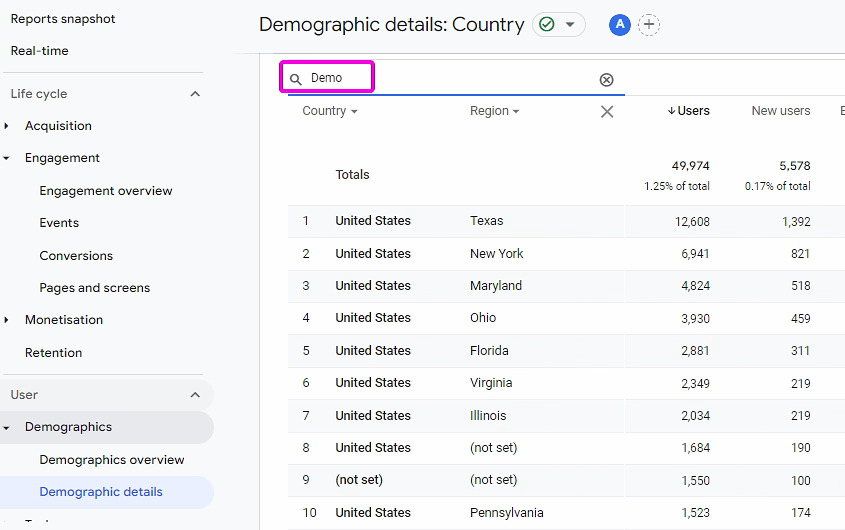
Note that we are still looking only at the stats for the specific flipbook called Demo that we selected in step 3. Even though we replaced the Landing page column with the Region now!
💡TipIf you are more interested in City-level stats than State-level, you can change Region to Town/City.
How many visitors were new, and who visited my flipbooks before?
Although Google Analytics has a special Retention tab, there is a very informative graphic on the Reports snapshot.
.avif)
If you scroll down, you will see the retention rate for all visitors over the past 6 weeks.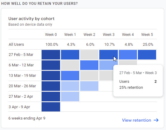
Let’s take a look at the details:
- 6 weeks ago (first line), we had 8 visitors (this number is not visible on the screenshot; you can see it by hovering over the dark blue black Week 0 of the first line). The screenshot shows that of those 8 visitors, 2 also visited us 3 weeks later, a 25% retention rate.
- 5 weeks ago, we had 13 visitors, one of whom returned 3 weeks later. This is shown in the second line.
- 4 weeks ago, we had 7 visitors, none of whom returned 3 weeks later. This is shown in the third line.
- We can’t yet say how many visitors returned 3 weeks later for flipbooks that we created only 3 weeks ago, or even less.
Overall we had 8+13+7 =28 visitors who could return after 3 weeks. Three of those actually did. This gives us a 3/28 = 10.7% retention rate for week 3
Which links in your flipbook were clicked?
What if your flipbooks contain links to other pages, and you want to see how often these were clicked? Unfortunately, there is no standard report for that.
In such cases, you can create an Exploration. Explorations go beyond standard reports and help you uncover deeper insights into your customers' behavior. Google describes how they work in detail. Explorations are more difficult, but the example below should get you started.
Preparing the report
- Select Explore from the side menu.
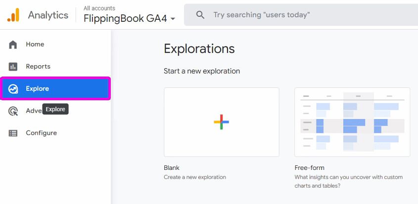
- Create a new Blank exploration.
- Adjust the date interval as required. Explorations can only use data from the past 90 days!
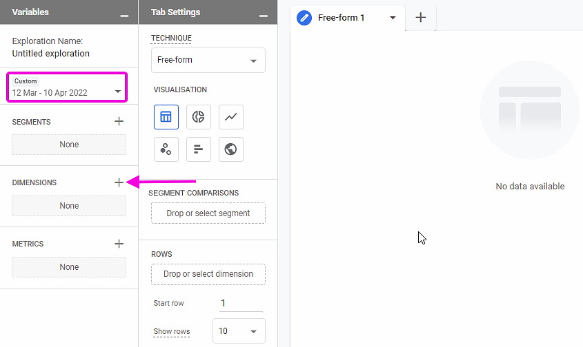
- Click on the + after Dimensions to add the kind of data that you want to include in your report. In our case, we are interested in the following:
- The flipbook name. This is represented by the Page Title in the Page/Screen section.
- The URL of the links that were clicked, represented by Link > Link URL.
- The Event name. We are only interested in links clicked so we will need to restrict the report to only those events.
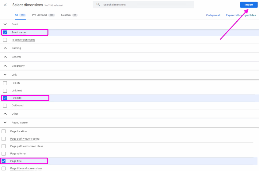
- Now click on Import to add these to your Exploration
- Next, click on the + behind Metrics to add the actual data that you are interested in. We are interested in the number of times the links were clicked. So we add Event > Event Count and click Import
Setting up the report
We have now selected the variables that should be used in our report. But no data is shown yet. To see the actual data, we have to set up our report itself.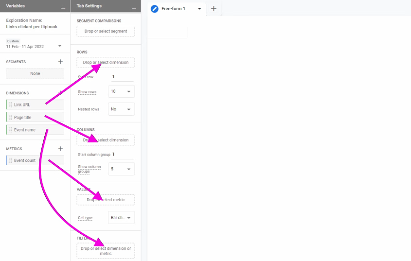
- Drag the Link URL dimension to Rows
- Drag the Page title dimension to Columns
- Drag the Event count metric to Values
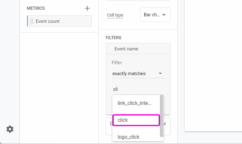
- Since we only want to see data for links clicked, we drag the Event name to Filters. We then set the filter type to ‘exactly' match ‘click’. Google's event reference contains the exact names of all automatically tracked events.
When we click apply, we see the full report as shown below. From the Delonghi product manual, 3 links were clicked once each: 2 to their site, and a single click (on the Flippingbook logo) to FlippingBook's site. In our Demo publication, there was also one visitor who clicked on the logo.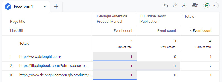
Explorations can be used to create all kinds of specialized reports. Experienced Exploration users may even want to add custom flipbook events in their explorations. Refer to our reference article for more information.
What devices did my visitors use?
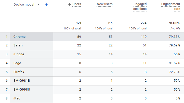
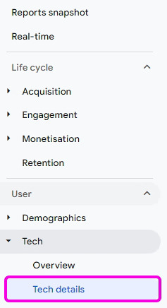
In general, you can get information on the devices the readers used to browse your flipbook in the User > Tech > Tech details section.
If you need to get a sense of a general distribution between device categories, click on the dropdown menu above the first column in the table in this section and select the parameter Device category.
.avif)
If you rather need the exact list of device models, select the parameter Device model. If your visitors used a PC or Mac, you will see their browser instead of the device model in the column.