
Creating impressive email designs is not just about dragging and dropping text and visuals in a DIY template builder. It involves meticulous planning and strategic placement of all the design elements.
Check out this email by Buffy. The copy, images, and CTA are perfectly aligned and in sync with each other.
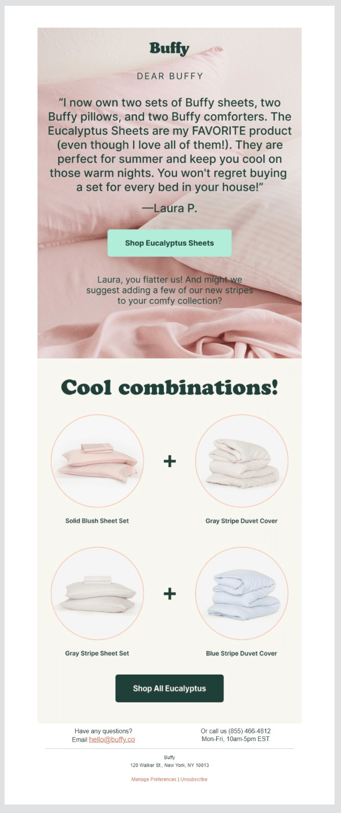
Source: Milled
Moreover, you must pay special attention to your email designs due to the dwindling attention span of subscribers. The average time spent on an email dropped to 11.82 seconds in the year 2020.
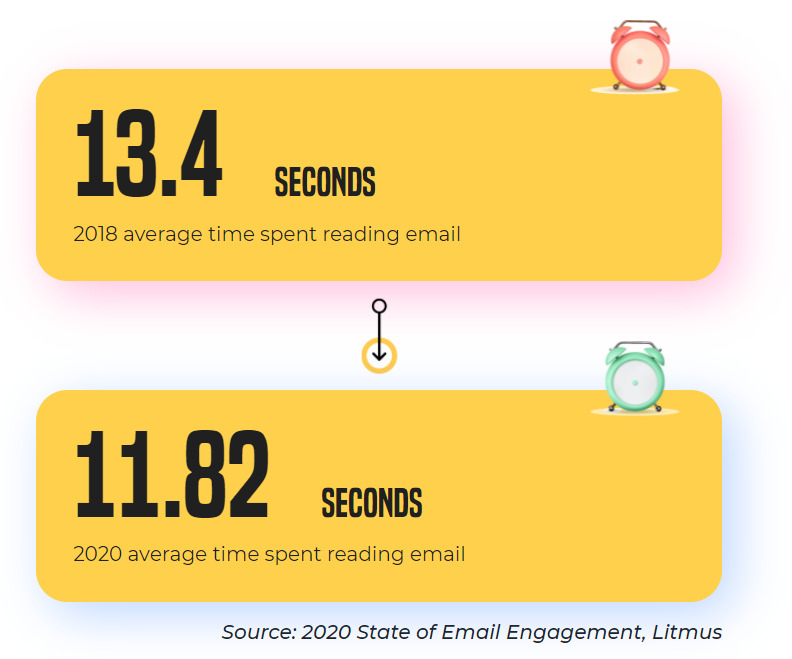
Source: Email Uplers
Therefore, it has become vital to convey the purpose of your email instantly. And a well-designed email does just that. But don’t worry, even if you’re not a professional designer, your email designs can render well and leave a profound impact on readers. In this article, we’ll tell you about the tips and tricks for creating enticing emails.
Let’s begin with discussing the email inbox best practices.
Have an Identifiable From Name
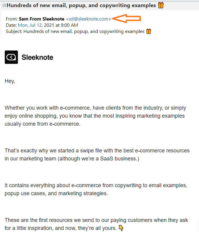
Take a look at this screenshot.
It instantly lets the user know that the email was sent by “Sam from Sleeknote”.
It is recommended that you send emails from an email address at your own domain because a free webmail email address or a “noreply” address will not go well with your subscribers.
Craft an Attention-Grabbing Subject Line
The ideal length of a subject line is up to 65 characters so make sure it is intriguing enough for the recipients and entices them to open the email. Test emojis and different types of subject lines to see what resonates the most with your target audience. Never craft a misleading or clickbait subject line just to get a higher open rate as it will hamper your brand reputation.
Include an Informative Preheader Text to Go with the Subject Line
The preheader text must elaborate on the subject line and let the users know more about what’s in store in the email: 30 to 55 characters will be perfect. Just like your subject line, your preheader text must be short enough to pique curiosity and long enough to convey the purpose of the email.
Next, we’ll talk about email design best practices that will help you provide a pleasant reading experience for your subscribers.
Always Adhere to the Email Accessibility Guidelines
Some of your subscribers are using adaptive technologies or tools such as screen readers, screen magnifiers, eye tracking systems, and advanced sip-n-puff devices. To cater to people using such technologies, you must create accessible emails.
These are the points to remember to ensure email accessibility:
- Left-aligned email copy is of utmost importance for designing accessible emails. Do not align it in the center as people with dyslexia will find it difficult to read.
- Maintain a logical reading order by using semantic tags like <p>, <h>, and <table>. Assemble the content from left to right and top to bottom. It will help screen readers understand the flow of the email copy.
- Add Alt-text to visual elements for subscribers using screen readers to hear the Alt-text.
- If you are using GIFs in the emails, avoid adding any animations that have a flashing rate between 2 to 55 Hz. It can affect readers with photosensitive epilepsy.
- Pick the color scheme wisely and use contrasting colors. A dark background with light text or dark text on a light background will be the ideal scheme.
- The CTA button should be 44x44 px in size with the size of the text at 16 px or more.
Organize Your Email Layout Properly
While designing your email template, comply with the principles of visual hierarchy. Go for the inverted pyramid design pattern, as shown in the image below.
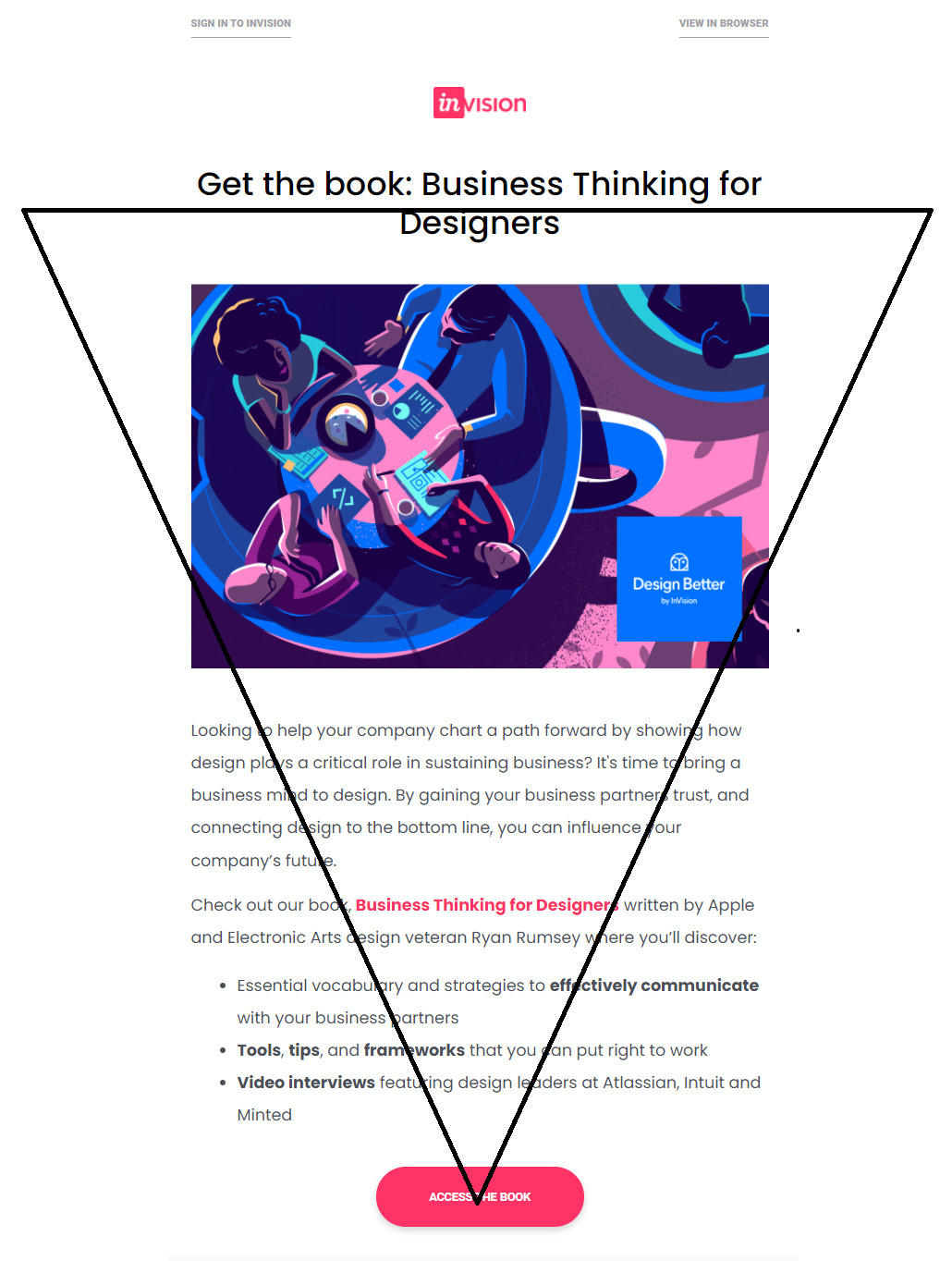
Source: Email Uplers
Such designs make the information shared in the email easy to consume. The most important information is placed in the first fold and the top 350 px. It is chalked out in such a way that it guides the reader toward the CTA and gets them to click through.
In case you need to send out a lengthy email copy, break it into readable chunks by using bullet points, numbered lists, or separators. Have ample white space to keep people engaged with your email.
Focus on Using the Right Typography
It is natural for marketers to get tempted to use fancy fonts. However, we strongly recommend using web-safe fonts from the Serif or Sans Serif family. The three most popular font styles are Times New Roman, Arial, and Verdana. In case you need to send out an email with custom fonts, provide a proper fallback so that there are no rendering issues.
Here are some more tips to follow:
- Font size is another important aspect to consider. The title font size must be 22 px or more.
- Keep the copy line width at 6 words with the font size of 14-18 px.
- Line spacing must be around 1.5 times the font size.
These figures work well for both desktop and mobile devices.
Be Wary While Using Visuals in Emails
Using images in emails has become almost mandatory with the increasing popularity of visual marketing. There is a natural disposition to consume visuals faster than plain text. That’s exactly why you must consider adding relevant images in your emails. Just make sure you use this checklist when you add visuals in emails.
- Every image must have a suitable Alt-text to go with it. (This will inform the subscribers what the image is about, even with images turned off.)
- The text to image ratio should be 80:20.
- Compress the images so that the email does not get too slow to load.
- Test the emails for flawless rendering across all email clients and devices.
- Never send an image-only email as it can trigger spam filters.
- Check for dark mode compatibility before sending the emails. It should render well in light theme as well as in dark mode.
You can even think about adding not only images but also GIFs in your emails to make them more interactive and eye-catching. For instance, check out a product update newsletter from FlippingBook.
|

Do not Neglect Your Email Footer
If you consider the email footer insignificant, think again. You can use this section for your email signature, contact information, and all those important disclaimers.
Here are some tips to design an effective footer for your email:
- Include your physical address and customer service email ID so that customers can easily reach out to you.
- Organize content to be included in the footer with all the visual hierarchy principles in mind.
- Add social media links in the email footer. Doing so will enhance your social media visibility without spending a single penny.
- You can use different font sizes, colors, and enough white space to create clean sections without any clutter.
- Consider using a background color to separate the footer and the email body.
- You must have an unsubscribe link in the email footer, as suggested in the anti-spam guidelines.
- Let your users know why they are receiving your email with a disclaimer in the footer. It will not only reduce your unsubscribe rate and spam complaints but also build your brand credibility.
Wrapping Up
Are you planning to design a customized email from scratch? Well, this guide will surely come in handy to you and help you create a visually appealing email adhering to all the design best practices. Make sure you bookmark it for future reference.
Author's bio: