Graphic design is critical to branding. Adding visuals to your marketing collateral and business proposals helps give your brand a professional look as well as convey your message to your target audience in a powerful way. The result? You increase your chances of getting them to take your desired action.
Even if you’re not a graphic designer, it helps to know the graphic design principles every brand should follow. So next time you have to create a digital brochure or make a presentation for a business idea, you’ll know exactly what to do.
Let’s discuss each design principle in this blog post.
5 Graphic Design Principles That are Important for Business
Think of graphic design principles as the building blocks of your marketing collateral and business presentations. If a marketing email or a business proposal, for example, are not based on these building blocks, they will not stand on their own. So you should stick to graphic design principles to make your content effective in delivering your brand message.
#1 Hierarchy and Contrast to Highlight the Core Message
Hierarchy is critical in design because it ensures visual organization. You can establish hierarchy by:
- Varying sizes: The bigger an element, the higher its rank in the hierarchy. This is where the viewer should look first.
- Varying placement: The higher the rank of an element in the hierarchy, the higher its physical placement.
You use hierarchy to tell the viewer where they should focus first when viewing your work.
In blog posts, for instance, hierarchy is primarily established by varying the sizes of elements. The main headline is the first thing a reader sees because it comes in a bigger font. The subheading is what they read next because it comes in a slightly smaller font. The body is the last thing they read due to its smallest font.
You can be effective in presenting business proposal ideas or promoting company products by ensuring the viewer’s attention focuses on your core message. That means the most important words should appear in the biggest font, as in this blog entry from Hubspot:

Source: Hubspot
Contrast also draws the eye. With contrast, you can highlight the differences between two or more elements in a composition. You can use strong color to emphasize contrast.

Source: Insider
In the above example, you see each figure standing out because of the contrasting background.
#2 Repetition for Better Brand Recall
Repetition is simply reusing the same element several times in a design. You do that to help the viewer make associations among the elements without explicitly telling them the elements are linked together.

Source: 254 Online
You can use repetition for brand recognition, too. For instance, when you use your logo design and color palette consistently across your marketing collateral, products, and business presentations, you establish a defining look for your brand. That’s important because you want viewers to associate elements of design with your brand immediately when they see them.
Coca Cola is a great example of a product that has achieved brand consistency.

Source: One2create
It doesn’t matter if “Coca Cola” is written in different languages. When people see white font against a can’s red background, they know what brand and beverage it is.
#3 Color Psychology to Drive the Message Home
Scientists have made important observations about how people generally respond to a specific color. The study of how hues influence human behavior is color psychology.
You’ll need at least a basic understanding of color psychology because according to Inc, 95% percent of purchasing decisions are subconscious. In other words, people take action based on what they see and how it affects their emotions. This means you need to choose the colors in the logo, packaging, marketing materials, business proposals, among others, carefully.
Here’s a list of colors and the concepts humans usually associate with each of them:
- Red: Passion, energy
- Gold: Royalty
- Blue: Comfort, trust
- Green: Wealth, health
- Yellow: Positivity
- Black: Prestige, power, timelessness
- White: Cleanliness
If you have an understanding of color psychology, you can choose the colors that best convey your brand message and get people to feel and act a certain way. In short, you can create powerful content that can achieve your goals.
Let’s take Rolex as an example:

Source: The Watch Company
Rolex is an iconic Swiss luxury watch brand. The people behind the Rolex logo chose colors that connote royalty and wealth—gold and green, respectively. This color pairing attracts people who have an inclination for the finer things in life.
Let’s go through another example—if you’re creating a marketing email to get people to register for an event and you want to grab their attention, why not make something like this?

Source: BIll Kenney on Dribbble
The contrasting colors—red and white—make the CTA button stand out. The color red also indicates passion and energy, and those are the things you want your viewer to feel so they will take action.
#4 Balance and Space for Better Readability
Balance in graphic design refers to the equal distribution of visual weight among elements in a composition.
There are four balance types:
- Symmetrical: The visual weight of each of the elements is equally split into two, like a mirror image.
- Asymmetrical: This balance uses scale, contrast, and color to level out a layout's flow. You can see it on websites where two sides of a web page vary but contain similar elements.
- Radial: The elements are in a circular pattern.
- Mosaic: The composition lacks distinct focal points.
Each of these balance types stands for something. Symmetrical balance, for example, connotes elegance and perfection, while asymmetrical balance is more dynamic and interesting. On the other hand, radial balance evokes movement, while mosaic balance creates a sense of disorganization.
Space, on the other hand, can be used to separate and link elements in a composition. Wider spaces distinguish elements from each other, while elements connected by narrow spaces highlight interaction.
Depending on what you want to convey, you can choose any type of balance when laying out visual elements in your marketing collateral or business proposal. Your copy, however, needs to be readable. That means there should be enough space between each letter, word, and sentence so your viewers can understand your message clearly.
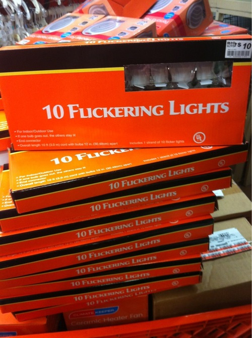
Source: InspirationFeed
The design world is littered with examples of character and word spacing done wrong. For instance, in the product packaging above, it’s easy to mistake “flickering” for something off-color. While the typeface the designer used is very appealing, it unfortunately doesn’t fit its intended purpose because of the way it’s spaced.
#5 Variety to Capture the Customer's Interest
You use variety in design to produce visual interest. A design can very easily become monotonous without variation, causing the consumer to lose interest. You can create variety through color, typography, pictures, shapes, and more.

Source: Variety
You can also use variety to convey your brand message. Dropbox, for instance, does this:
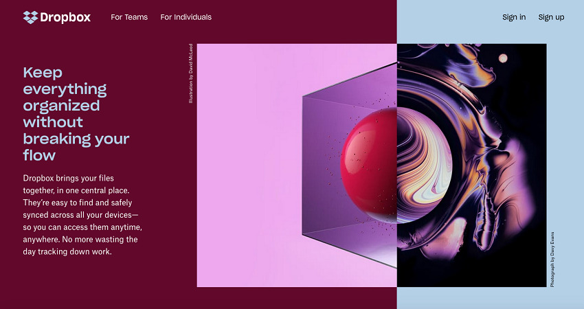
Source: Columnfivemedia
With variety, Dropbox drives home its core message: regardless of the type of data you use and store, Dropbox’s storage and file organization features will help improve your productivity.
The Bottom Line
Graphic design is key to branding. Visuals help make your marketing collateral and business presentations look professional and convey your brand message effectively. That’s why understanding graphic design principles is essential. In this article, we’ve looked at five principles: visual hierarchy and contrast, balance and space, repetition, color, and variety. Here’s are the main takeaways from this article:
- Use visual hierarchy to organize your visual elements according to importance.
- Decide on the balance of your visual elements, depending on what you want to convey. Make sure there’s enough space between letters, words, and sentences in your copy, because it needs to be readable.
- Repeat relevant elements to establish brand recall. Use the logo and color palette consistently across your marketing collateral, products, and business presentations to establish a defining look for your brand.
- Use color to get people to feel a certain way and take action.
- Employ contrast to let relevant elements stand out.
- Use variety to break the monotony in your marketing collateral or business presentations. Additionally, consider leveraging image annotation techniques to add informative notes, comments, or markups directly on your images, enhancing their visual impact and conveying your brand message effectively.
Now it’s over to you. Use these principles to your advantage. Get to know your audience so that you can create powerful content that conveys the right message and drives people to take action.
