.jpg)
Have you ever noticed how various colors can make you feel different emotions? For example, the blue Facebook logo often evokes a sense of calm, while the red Coca-Cola logo feels energetic and lively. This phenomenon is called color psychology.
In marketing, understanding color psychology helps brands build stronger emotional connections, influence purchasing decisions, and stand out in a crowded marketplace.
In this blog post, we’ll explore how different colors affect consumer behavior, offer tips for choosing the right palette for your brand, and share real-world examples of effective color strategies.
What Is Color Psychology?
Color psychology is the study of how different colors and tones influence human behavior. They elicit associations that influence mood and decision-making. Personal differences and cultural backgrounds can lead to diverse perceptions of colors. Psychology of color investigates how colors impact our lives, inspire emotions, and provoke reactions.
Why Does Color Psychology Matter in Marketing?
Color psychology is widely used in marketing because color influences how buyers react to different brands or products. Brands select their color palettes to convey the feelings they want you to associate with them.
Research indicates that individuals form decisions within 90 seconds of encountering a person or object. Color plays a significant role in 62% to 90% of these choices. Thus, using color effectively can distinguish a product from its competitors and impact moods and emotions, shaping consumers' attitudes toward the product.
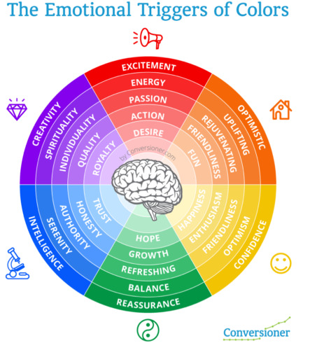
Source: Conversioner
This marketing color wheel shows that colors can affect a range of emotions. You can achieve positive results by using this effectively in your marketing strategy and brand positioning. However, remember that color psychology should only be employed to align your business goals with your prospective buyers, ensuring a win-win situation, rather than manipulating your customers.
Key Color Combinations and Associations
Choosing the right color palette can significantly influence how people perceive and engage with your brand. Colors in marketing are more than just a visual choice—they’re emotional cues that influence feelings, decisions, and actions. Here’s a quick look at some key colors and the emotions they most commonly evoke:
♥️Red — energy, passion, urgency.
💙Blue — trust, reliability, calm.
💚Green — growth, health, tranquility.
💛Yellow — optimism, happiness, warmth.
🖤Black — sophistication, power, elegance.
🤍White — simplicity, purity, clarity.
While many brands center their logo around one primary color from the marketing color wheel, they also develop a full color palette for their brand books and other marketing materials, combining different shades and tones to create unique emotional associations and a consistent visual identity.
To better illustrate how the psychology of color works in practice, let’s explore 5 design examples and see how color choices shape emotions. Below are free Canva templates created by the FlippingBook team—perfect for crafting magazines, brochures, newsletters, catalogs, or digital flipbooks. You can use any of them for free, customize for your needs in Canva, upload your finished design to FlippingBook via a handy integration, and add interactive elements.
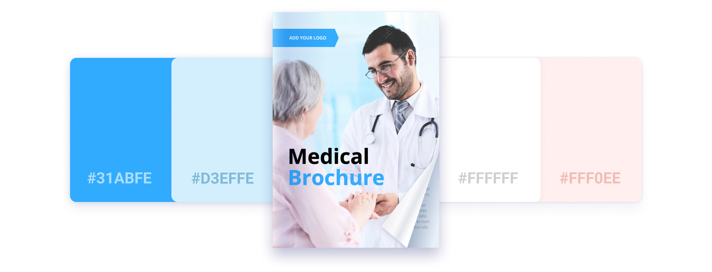
💊Medical Brochure Template
Color palette: Bright blue, navy blue, and white.
Association: Bright blue color associates with cleanliness and clarity, which seems an ideal combination for healthcare marketing. Navy blue adds trust, seriousness, and professionalism. The dominance of white space ensures a clean, minimalistic look that feels approachable and safe.
Best for: This color palette is a perfect fit for hospitals, private clinics, medical research centers, or any healthcare provider who wants to appear serious and trustworthy.
Want to use this template?
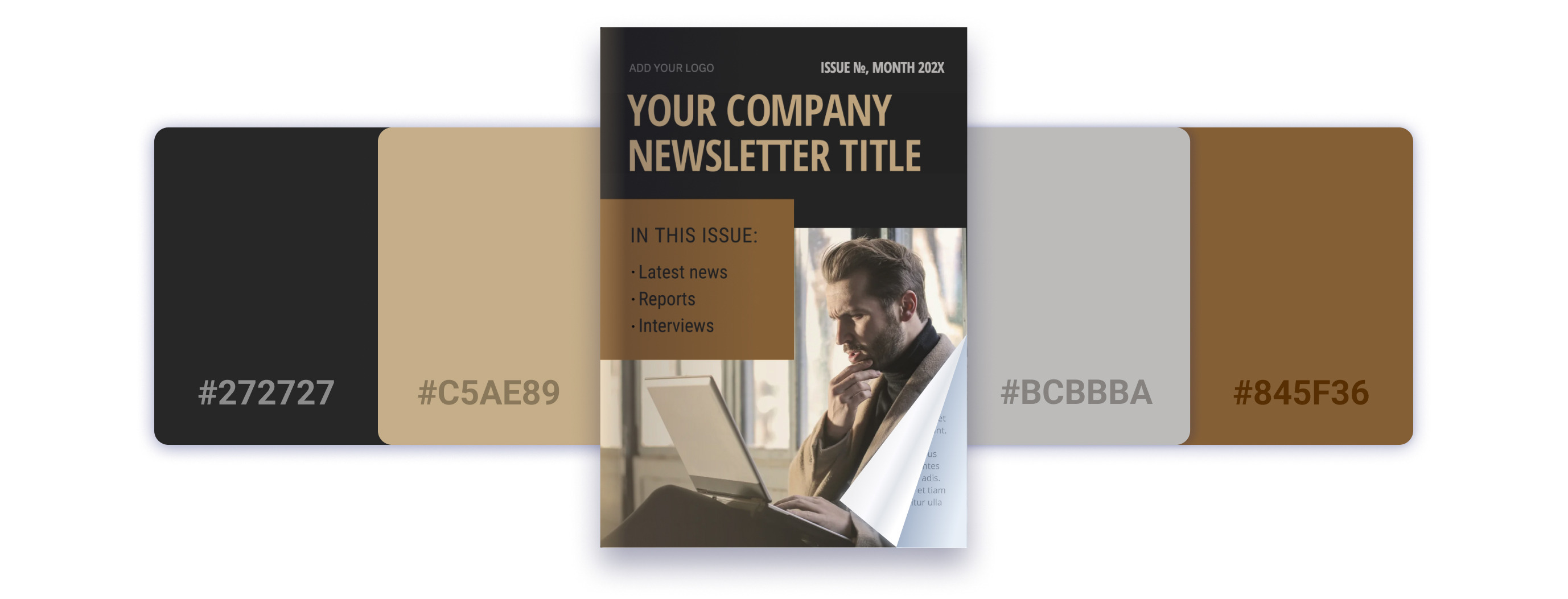
💻Company Newsletter Template
Color palette: Black, soft beige, and white.
Association: This palette creates a professional, elegant, and trustworthy atmosphere. Black conveys power and sophistication, making it a strong choice for business communications. Paired with soft beige, it adds a sense of balance, comfort, and class. Text in white color provides feelings of purity, minimalism, and calm, keeping the overall design clean and easy to read.
Best for: Great for professional newsletters, company announcements, or any materials where you want to project reliability and confidence.
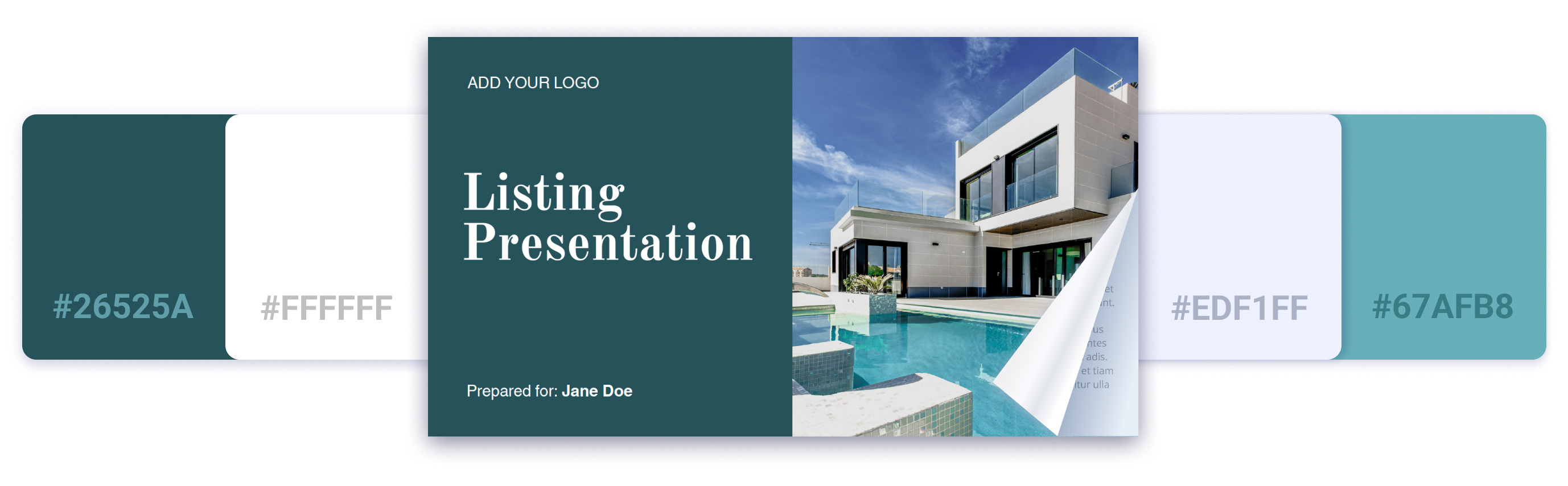
🏡Listing Presentation Template
Color palette: Teal, turquoise, white, and Alice blue (a pale tint of azure).
Association: What feelings do you associate with ‘home’? Let us guess: calmness, tranquility, relaxation? That’s why this color palette is such a great fit for real estate marketing. Turquoise evokes a sense of serenity and emotional balance, while teal symbolizes stability and groundedness. Alice blue, with its soft, airy tint, adds an extra layer of peace and a welcoming vibe.
Best for: Ideal for real estate brochures, newsletters, property listings, and other marketing materials. These colors gently guide your audience toward a calm, centered mindset, making them feel at home even before they step through the door.
Want to use this template?
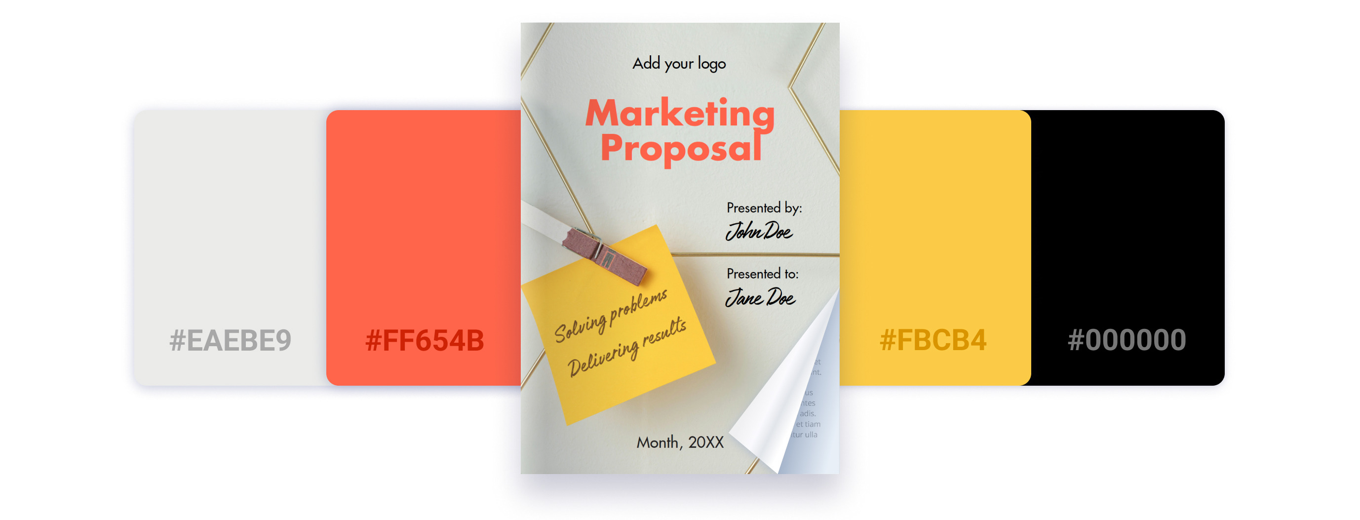
💡Marketing Proposal Template
Color palette: Beige, muted terracotta, yellow, and soft gray accents.
Association: A marketing proposal should reflect professionalism, confidence, and inspiration—and this template strikes the perfect balance. It features a thoughtful mix of colors to achieve that effect: vibrant yellow energizes the design and symbolizes ambition; beige and sandy tones convey stability and reliability, and muted terracotta adds a touch of warmth and vitality without overwhelming the viewer.
Best for: Perfect for marketing proposals, business proposals, corporate brochures, and project pitches where you want to appear trustworthy, experienced, and forward-thinking.
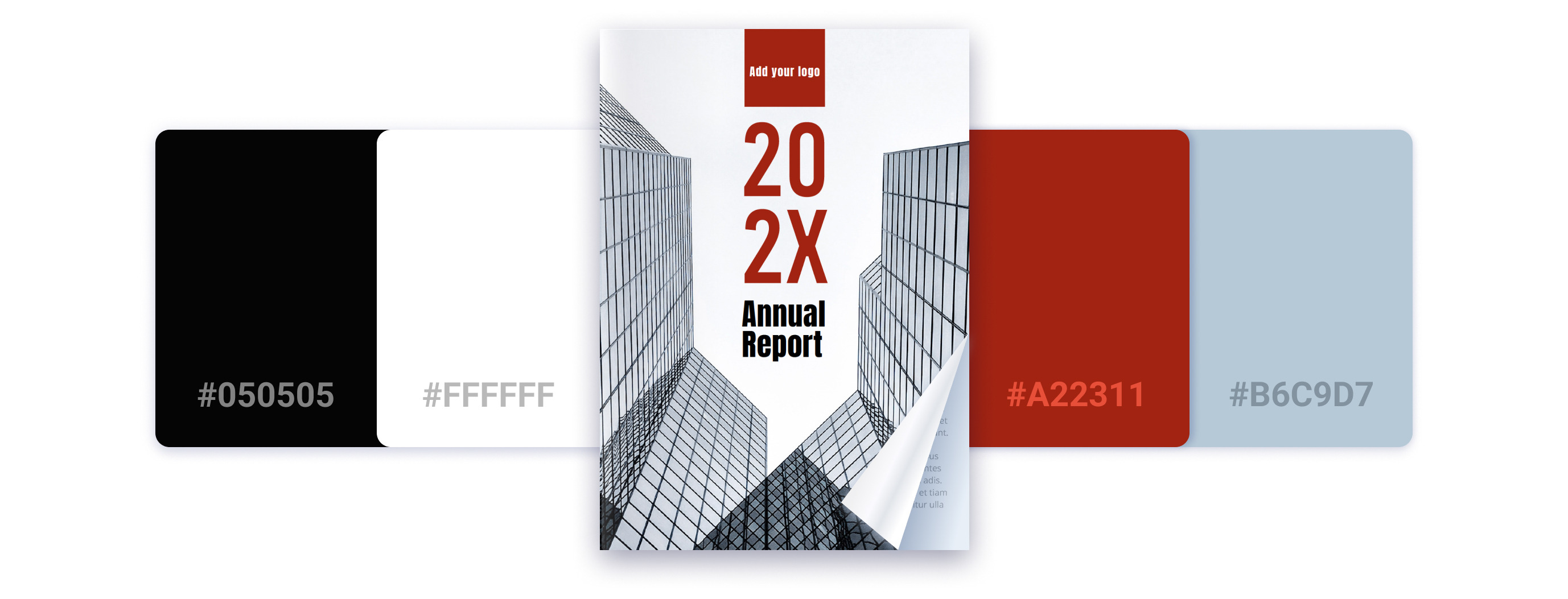
📊Annual Report Template
Color palette: Muted terracotta, soft beige, dark brown, black, and white.
Association: This warm, grounded palette feels stable, approachable, and authentic. Muted terracotta adds a sense of energy and creativity without feeling loud or aggressive, while soft beige creates balance, approachability, and a natural flow. Dark brown or black elements provide contrast and structure, keeping the design polished and professional. The use of white space helps maintain clarity and keeps the overall look clean and easy to navigate.
Best for: Perfect for annual reports, company reviews, nonprofit reports, or any materials where you want to combine professionalism with a sense of modernity, warmth, and trustworthiness.
Creative Flipbook Examples
Color is a powerful tool that helps you connect with your audience on a deeper level. By maintaining brand consistency across all your digital documents, you can strengthen recognition and also enhance the emotional impact of your content.
To create an even stronger reader experience, you can transform your PDFs into digital flipbooks and customize them with various backgrounds to match your brand style. This ensures a seamless, professional look and feel that builds trust and leaves a lasting impression.
Smart color choices are key: aligning your flipbook’s palette with your brand identity reinforces recognition and evokes the right emotions, whether you want your audience to feel inspired, reassured, or energized.
Let’s take a look at a few creative examples of how brand color psychology can make your flipbooks visually appealing and emotionally engaging.
🌴Hilton Travel Brochure
What comes to mind when you see a travel brochure? Holidays, relaxation, sandy beaches, palm trees, city sightseeing? That’s exactly the feeling Hilton taps into with their travel flipbook about Bangkok. They use a vibrant background of green palms and warm, sunny orange tones, instantly transporting you to a beach, lying under palm tree shadows, listening to the soothing sound of waves, and sipping a cold drink. Admit it—you felt like diving right into that scene, didn’t you?
As you flip through the brochure, you’ll notice a bright, lively color palette that provides a sense of adventure, joy, and curiosity. The picture galleries on pages 8–9 offer a variety of views of the sightseeing spots, sparking even more excitement and the desire to explore. Animated GIFs, like the ones on pages 10 and 16, bring the culture to life, making the images of Bangkok feel vivid and real.
Altogether, the visuals, colors, and animations create an immersive experience that draws readers in and ignites a strong desire to see Bangkok with their own eyes.
💡 Want to brand your flipbook to the fullest?
Customize your flipbook link to reinforce your brand identity, increase trust, and drive more engagement with your content.
🚘BMW Group Investor Presentation
BMW Group Investor Presentation
This flipbook projects an air of class and style—exactly what the BMW presentation is all about.
The brand uses a textured gray background that looks like a road, reinforcing the theme of movement and performance. Deep green accents hint at nature, growth, and harmony, subtly suggesting that owning this car brings balance and a connection with the world around you.
The presentation mainly features a classic business color palette: black, white, blue, and gray. These colors represent trust, stability, sophistication, and a sense of luxury—a perfect combination for a presentation aimed at investors and premium clients.
⚡Virgin Media Booklet
Virgin Media is a British telecommunications company that provides telephone, television, and internet services across the United Kingdom, and you can instantly feel it through their flipbook design. Dim lighting, nighttime scenes, and glowing windows all evoke a strong sense of ‘home.’
The GIF on the cover adds a dynamic effect, creating a sense of speed and lightning-fast connections. The bold red color throughout the flipbook radiates energy and power, perfectly aligning with the brand’s identity as a leader in telecommunications. Meanwhile, white text balances out the intense red, bringing a sense of clarity, peace, and trustworthiness.
Together, these visual elements convey a strong emotional message: this is a brand you can rely on to deliver powerful, seamless communication to your home. See how the colors tell the story, even before you read a single word. That’s why brand color psychology is so important.
Tips for Choosing the Right Colors for Your Marketing Materials
Choosing the right colors for your marketing materials is more than just picking shades you like—it's about creating an emotional connection with your audience and supporting your brand identity. To help you make smart and effective choices, here are some key tips to keep in mind:
1. Align colors with your brand
There are countless colors and combinations to choose from. Before making your selection, think about your brand and ask yourself these questions:
- Will these colors maintain my brand consistency?
- Will they align with my brand values?
- Will they accurately reflect my brand identity?
For example, imagine you run a luxury real estate agency with brand colors like black, gold, and white. If you suddenly opt for pink, a color often associated with playfulness and romance, your audience might feel that something is off. They expect a serious, sophisticated brand, not one evoking lighthearted emotions. Your color choices should reflect and amplify the essence of your brand, helping to build trust and set the right expectations.
2. Know your target audience
While it might sound like obvious advice, it’s more nuanced than it seems. Brands sometimes assume they understand their audience but overlook important cultural and emotional associations.
Colors can carry very different meanings across cultures—for instance, a color that feels joyful and positive in one region might symbolize mourning or danger in another.
For example, when Pepsi changed its branding from dark blue to light blue in some Southeast Asian markets, it unintentionally caused a negative reaction. In several cultures across the region, light blue is associated with mourning and death. As a result, the rebranding campaign didn't resonate with the audience and even harmed the brand’s image. This shows how crucial it is to understand not only your target audience but also the cultural meanings behind colors.
3. Focus on emotional impact
Think about the emotions you want to evoke. Do you want your audience to feel happy and relaxed while browsing a travel brochure? Or serious and focused when choosing their new home? Select colors that create the right emotional tone for your goal, while staying true to your brand identity. Smart color choices can enhance your message and make your materials more persuasive and memorable.
4. Ensure readability and accessibility
When selecting colors, make sure they work well together, not just visually, but also in terms of readability. Even if your background colors fit your brand perfectly, poor text contrast can ruin the entire effect. Always check that your text stands out clearly against the background. Light text on a dark background (or dark text on a light background) typically improves readability and accessibility, ensuring your message remains easy to read and engaging.
5. Test your colors
Now that everything is ready, it’s time to test your results. Get feedback to see how people actually perceive your color scheme and whether it creates the intended emotional impact. You can also experiment with different color combinations and use simple quizzes to find out what resonates best with your audience. Testing helps you fine-tune your materials and make sure your colors work as powerfully as possible.
Final Thoughts
Color psychology in marketing is a crucial part of effective branding. It influences everything—from your logo and marketing materials to store designs, merchandise, and beyond. By understanding the psychology of color, you can connect with your audience on a deeper emotional level, strengthen brand recognition, and achieve better marketing results.