Recommendations for PDFs
Sometimes clients ask us if we have any recommendations for the PDFs that they use to make flipbooks. There certainly are a few things that could be useful to know. If you don’t design the PDF yourself, feel free to pass this article to your designer.
- Should I use a specific PDF format or version?
- What quality should I use for my images/how much PPI?
- What page size do you recommend?
- What font size should I use?
- Any tips for text?
- Should I export my PDFs as single pages or spreads?
- Can I use different-sized pages?
- How do you handle crop marks?
- Should I add links in my PDF or in FlippingBook?
- Should I add bookmarks to my PDF?
What PDF format or version should I use?
Most PDFs import fine, the only true exception is XFA. This format is used for PDFs that are enriched with dynamic forms that you can fill out. Adobe itself says that “In many ways, the XFA PDF file format is closer to an HTML file than it is to a traditional PDF file.” If you have Adobe Acrobat Pro, then you can distill the PDF to turn it back into an ordinary PDF, which you can import without any problem. You’ll lose the forms in that case.
We recommend using PDF version 1.4 (Acrobat 5.0) or higher. You can import PDFs in version 1.3 or lower, but they may show small hairlines in images. PDF/A is not recommended either because the text quality will be significantly lower than with other PDFs.
What quality should I use for my images/how much PPI?
It depends on your page size, but generally speaking, there is no need to use more than 225 PPI.
In more detail: Flipbooks are intended for on-screen presentations. Your pages are built from images. The largest image that we use for a full page is 2700 pixels in height or width. That means that a typical A4 page is 1911 x 2700 pixels. We resize high-resolution images to fit into that size. This ensures that your pages load quickly while keeping the quality more than acceptable, even when zoomed in.
It's no problem to use a slightly bigger image than 225PPI, but we advise you not to use extremely detailed images. If you use an image with a width of 20,000 pixels, we will resize them by about a factor of 10. Such extreme resizing can actually make the image look worse!
What page size do you recommend?
There is no need to use a specific page size. We will optimize your design to match typical screen sizes as follows:
- For landscape-oriented pages, we will use a 1-page view with page flip effect by default
- For square and portrait-oriented pages, we will use a 2-page view by default
- For any flipbook, we will fill out the available screen space until the maximum width or height is reached, whatever comes first.
As a result, an A3-sized page looks exactly the same as an A5-sized page. But what is important, is to use a large enough font in relation to the page size! Note that you can control the page flip mode.
What font size should I use?
We suggest using decent-sized fonts to increase readability. Reading from a screen requires larger fonts than in print, especially when reading on mobile. Text that looks fine on a printed A4 can be very hard to read without zooming in.
- If your pages are A5/Half Letter-sized then we recommend 12-point fonts (or 10-point fonts as a minimum). Your text will be readable on most screens without zooming for most readers.
- If your pages are A4/Letter-sized then we recommend not going much lower than 14-point fonts. This means that users with smaller screens, especially mobile devices, can read without excessive zooming.
Want to see it for yourself? We have made two example flipbooks for you with text in various sizes. Check out the A5-based flipbook and the A4-based one. We recommend you to open these books on a mobile device too.
Note! Not all fonts have the same size at 12 points. Individual fonts can be smaller or bigger. The numbers above apply to standard fonts like Arial, Helvetica, Times New Roman, Verdana, etc.
Any tips for text?
- When it comes to text, make sure that the text in the PDF is real text (i.e. it has a font, color, and font size and that you can copy/paste it from the PDF into another document). Sometimes we see that our clients' PDFs consist of images only, and the text is part of the image. If you use real text, then...
- It will be converted to an SVG image. That means that it scales very well and looks crisp and clear at all zoom levels.
- It can be searched for. Not just by your readers when they use the search option in the flipbook, but also by search engines, if you enable this option. This way people searching for text in your flipbooks can find it in Google, Bing, and other search engines
- Your readers can select and copy/paste text from your flipbooks (if enabled).
- Avoid 'hidden text'. To prevent conversion problems, delete invisible text completely instead of hiding it behind other objects, put it in hidden layers, or make it the same color. You can check for hidden text in Adobe Acrobat: Tools > Protection > Remove hidden information > Hidden text.
Warning! ⚠️If you remove hidden text, don't enable the other 'hidden information' options like 'Deleted or cropped content' or 'overlapping objects'.
Should I export my PDFs as single pages or spreads?
We can import both spreads and single pages, but advise single pages. Every spread is presented as a single page in our statistics, which may cause confusion later. If you want to use spreads anyway, you can. Our converting algorithm recognizes spreads, so the result will visually be the same. If you already used either spreads or single pages in the past, we advise you not to change between the two if you update the PDF and replace it. This can cause issues with content you add in our editor (it will stay on page X - which is different for spreads than for single pages) and will also cause discontinuity in statistics.
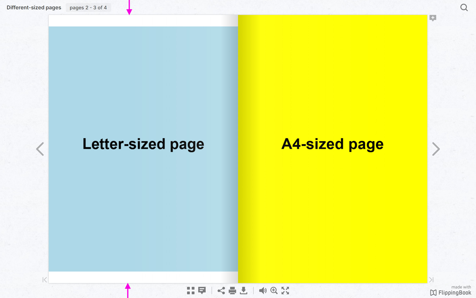
Can I use different-sized pages?
We don’t recommend different-sized pages, even though it won’t cause any technical errors. You can read more about it in our article that describes how we exactly handle different sized pages. One of the characteristics of our flipbooks is that all pages have the same size. So if you use different sizes, we will add extra white space around your pages to compensate. That looks a bit strange.
How do you handle crop marks?
PDFs that are designed for print sometimes contain lines in the corners called crop marks.
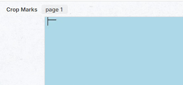
These lines show where the paper should be cut after printing by professional printers. Few printers can print edge-to-edge on a sheet of paper so they print your document on a larger sheet and trim it to size.
We don't remove such crop marks, so make sure to remove them from your PDF before you upload it. You can crop your PDF with Adobe Acrobat. You can also use free online tools like Sejda or PDF Resizer.
Should I add links in my PDF or in FlippingBook?
If you intend to add links from your flipbook to your website, then we recommend adding such links to your PDF. We will extract them exactly as you specify them. It is also possible to add links using our editor, which is a perfectly valid solution if you have just a few links or want to update one. But if you have dozens of links we recommend adding them to your PDF right away. This guarantees that if you later modify the PDF and add, move or remove pages, all the links remain in the right place.
Should I add bookmarks to my PDF?
If your PDF is divided into logical chapters or sections, then you can add bookmarks for each (sub)section. We extract these bookmarks and turn them into a table of contents. One more and easier way to create a table of contents is to do it directly in your account. You can make this table of contents even show up directly when the flipbook loads. This helps your readers navigate through large publications with ease.
In case you have problems importing a PDF, please see the troubleshooting guides for Flippingbook Online or Flippingbook Publisher.