Here at FlippingBook, we are working hard on making your process of creating publications more productive and efficient.
Today, we are super excited to introduce our brand-new release, packed with lots of useful features.
Watch our video to learn what’s new in no time.
Templates
If you often make publications that are similar to each other, you probably use the same settings and design elements for each one. So, every time you create a new project, you have to set the right look and the controls you need from scratch. This process can be quite time-consuming.
With this in mind, we are introducing our new feature: FlippingBook Templates. Templates allow you to save the settings you need and apply them as a default for future projects.
This means that when you create a publication, it will already have settings such as logo, skin, and controls in place from the start. This is very convenient and time-saving, especially if you often create publications with similar branding and design.
You can save as many templates as you need without making them default. When you need a particular template, just load it. The ability to store multiple templates can be very useful if you work with a variety of content types, such as brochures, catalogs, and reports.
Branding and Slide Mode in the Mobile Publication
In our previous release, we introduced an all-new mobile publication with clean design, a page flip effect, and interactivity.
We go further in improving your mobile experience—now mobile publications support logos and skins. This means that your clients will have the same experience with your content no matter where they access it—on a desktop, phone, or tablet.
It’s a great way to build your brand consistency. No matter what device your readers open your publications on, they’ll know it’s you and will enjoy the quality of your content.
What’s more, mobile publications now support slide mode. So, if you choose slide mode for a publication, it will work the same way on both desktops and smartphones.
Publication Preview
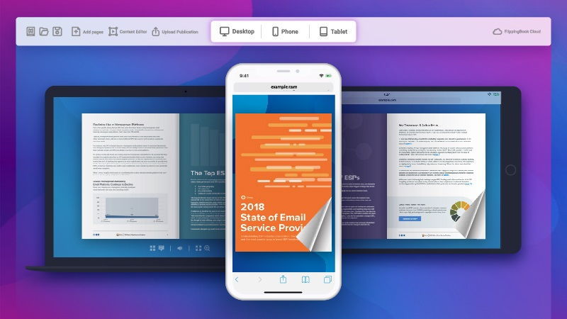
Now that our mobile version supports changes in publication look and feel, we have made it easier for you to track those changes with a new preview mode.
The new preview mode is simpler and easier to use. You can quickly switch between desktop, phone, and tablet mode to see what your publication looks like on various devices, and edit it right away. Thus, you can always be sure that your publications will look great on any device.
Menu Panel Redesign
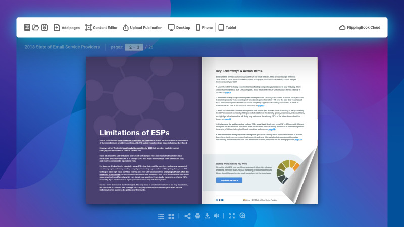
We’ve redesigned the menu panel so that all the important controls are right at hand. All the interactive elements, such as links, videos, pop-up images, and GIF-animation can now be found in the Content Editor section. FlippingBook Cloud manager has been moved to the right so it does not get lost between editing options.
Plus, the controls have been given nice new intuitive icons.
See the New in Action
That’s all for now. We hope that these features will make your working process more convenient, intuitive, and productive. And you will make a much better impression on your clients with your publications on any device.
Go ahead and download our newest 2.11 FlippingBook Publisher release. You can find the full list of new features and improvements in the release notes.
Get the latest version


