H&R Block, Domino’s Pizza, Netflix, Vueling. A tax preparation company, a fast food chain, a streaming service, and a Spanish airline.
What do they have in common?
All of these companies were fined for failing to comply with WCAG standards and provide accessible content to their customers.
And with the ADA (Americans with Disabilities Act) in the US, EAA (European Accessibility Act) in Europe, and new stricter directives, such as Title II ADA, cases like these will undoubtedly make headlines more often than ever.
But even without the accessibility laws and financial risks, making your content accessible is the right thing to do. It means being thoughtful and considerate, and improving everyday life for a substantial part of our society, not to mention winning over new customers and growing your business.
In this article, we’ll explore why it’s important to make PDFs accessible, tools for creating and remediating ready PDFs, and an actionable checklist for fully accessible PDFs.
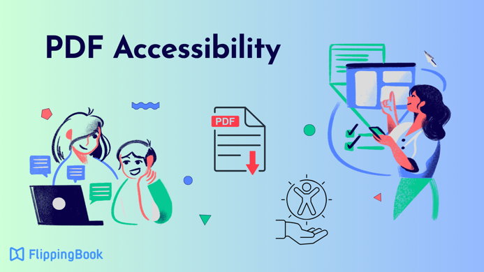
Why PDF Accessibility Matters
PDFs remain the most common format for many types of documents: from invoices and policies to catalogs and guides. PDFs are used for everything and everywhere. They are relatively easy to download and view, and offer some level of security, which makes them essentially omnipresent.
💡PDFs are a critical part of the user experience. Ensuring their accessibility is essential for reaching and serving all users effectively.
At the same time, PDF is a complex, often graphics-heavy format, not accessible out of the box.
Here’s just a small list of issues that can render a PDF inaccessible:
- No specified language: Confuses screen readers and hinders comprehension.
- No alt text: Makes images, charts, and other visuals inaccessible.
- Images-only: Scanned PDFs without real text cannot be read by assistive technologies.
- Poor color and design choices: Low contrast and complex layouts reduce readability.
- Structure problems: Missing headings, unclear links, and disorganized content make navigation difficult.
- No accurate tagging: Lacking proper structural tags causes screen readers to interpret content out of sequence and makes it nonsensical.
- Overlooking interactive elements: Forms, tables, and other interactive elements without accessible fields or proper structure are unusable for individuals relying on assistive technologies.
Accessibility Standards for PDFs Around the World
The first step to understanding PDF accessibility is knowing which regulations establish the global standards.
| Law | Where it applies | Main focus |
| Americans with Disabilities Act (ADA) | United States | Civil‑rights law banning disability discrimination in jobs, public services, and businesses; used to argue that websites, apps, and digital services must be accessible. |
| Section 508 (Rehabilitation Act) | The US federal government | Requires federal agencies and vendors to make their IT, websites, and digital documents accessible as a condition for use and procurement. |
| European Accessibility Act (EAA) | European Union | Sets accessibility rules for products and services, including many private‑sector digital services like e‑commerce, banking, and transport. |
| Equality Act 2010 | United Kingdom | General anti‑discrimination law; businesses and public bodies must avoid barriers for disabled people, including on websites and digital services. |
| Accessible Canada Act (ACA) | Canada | Federal law requiring the removal of accessibility barriers in areas like jobs, services, and communications, including digital services. |
| Disability Discrimination Act (DDA) 1992 | Australia | Bans disability discrimination in everyday services; inaccessible websites and apps can be treated as discriminatory. |
| Act on the Elimination of Discrimination against Persons with Disabilities | Japan | Requires reasonable accommodation and better accessibility, including for digital services. |
| Brazilian Inclusion Law (LBI) | Brazil | Broad disability‑rights law that includes duties to make online services and digital content accessible. |
| Rights of Persons with Disabilities Act, 2016 | India | Expands protections and requires better accessibility in services and information, including government and public‑facing digital content. |
Various international accessibility laws protect people’s right to receive digital services, both in the public and private sectors. PDFs, being an integral part of almost all client and business communication, naturally fall under these regulations, too.
How to Create an Accessible PDF?
There are two main standards governing PDF accessibility:
- WCAG 2.2 (Web Content Accessibility Guidelines): Defines best practices for accessible digital content.
- PDF/UA: A PDF-specific standard that ensures documents are fully accessible.
🦋 🤔What is the difference between WCAG and PDF/UA?
WCAG defines overall accessibility best practices for digital content. PDF/UA ensures PDF files meet those requirements through specific steps. In short, WCAG sets the goal, and PDF/UA shows how to achieve it for PDFs.
Here’s how to meet both:
#1 Make sure your text is selectable
This is essential for creating an accessible PDF. For screen readers to be able to recognize your text, the main content in your PDF should be searchable and selectable—not text in images.
#2 Give your content a clear structure
Your PDF content should be organized logically and coherently to make it usable with assistive software. Include:
- Headings
- Bulleted lists
- Page numbers
- A table of contents
#3 Specify the document title and language
Giving your document a descriptive title and setting the language is an important accessibility step.
- A descriptive title helps users quickly understand what the document contains.
- Setting the correct language ensures screen readers use proper pronunciation and rules.
#4 Choose dyslexic-friendly typography
Dyslexia is a learning difficulty that affects a person’s ability to read and write, affecting 20% of the world's population. Clear typography can make a big difference.
- Use fonts like Arial, Calibri, Verdana, Tahoma
- Make headings at least 20% larger than body text
- Use 1.5 spacing
- Ensure that inter-character spacing is 35% of the average letter width
#5 Create bookmarks
Bookmarks provide an alternative way to navigate the content. If you don’t include a Table of Contents paired with the Bookmarks structure in the document, it may mean that the only way to go through your text is to read it from start to finish. This makes navigation inefficient, and adding bookmarks is a simple fix.
#6 Add alt-text to images
Alt-text is a text description for any meaningful non-text content, such as images, graphs, charts, etc. It’s not visible, but screen readers need it to help users understand what the content conveys.
#7 Include tags
Tags are an Adobe Acrobat Pro feature that you can use to mark any element, both text and non-text. It provides assistive devices with the content’s structure and reading order, which makes it critical for the accessibility of a PDF document.
You can learn more about tags in this guide from Adobe.
⭐Tagging is 80% of success in accessibility
Kris Rivenburgh, a Chief Accessibility & Legal Officer at essentialaccessibility.com and the author of The ADA Book, argues that 80% of PDF accessibility comes down to tagging. And it becomes even more important if your PDF document has a complex structure with multiple columns and sidenotes.
#8 Color contrast ratio
WCAG states that you need to use a minimum contrast ratio of 4.5:1 (7:1 is preferred).
This requirement may be especially difficult to implement. For one, it can go against your or your designer’s creative choices. Also, a lot will depend on the color palette you choose, backgrounds, the scale of text, etc.
The only foolproof way to ensure your contrast ratio meets the WCAG success criteria is to run it through a color contrast checker as you develop the PDF design.
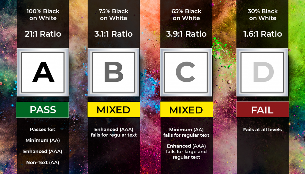
Source: CommonLook
🤔Is going 100% black-on-white the safest option?
Not really. In people with dyslexia, such a strong contrast can trigger a visual distortion, causing the text to blur together. To avoid this, you can opt for dark grey instead of black and softer alternatives for a white background. The good options would be cream or soft pastel colors.
#9 Links and forms
Remember to add descriptive anchor text to any hyperlinks to tell users where the link leads. Forms should be labeled correctly, and form fields should have tooltips.
#10 Tables
Screen readers often have problems recognizing tables, because they have a complex structure and the content within the cells may contain lists, paragraphs, or even another table.
To improve accessibility:
- Add headers to rows and columns
- Use a simple structure (avoid nested headers)
- Ensure content stays within cells
- Apply proper tagging
How to Remediate a PDF Document?
PDF remediation is fixing an existing PDF to make it more accessible. Arguably, learning to do that is even more important than creating accessible PDFs from scratch, because all of us have to deal with old documents that we don’t have either time or resources to throw away and redo.
Luckily, even if you don’t have a source document, there’s a lot you can do to fix the old documents:
- Check the accessibility of your PDF. You can do that with Adobe Acrobat Pro—it’ll tell you if your document conforms to the WCAG standards, and what needs to be done to improve its accessibility.
- Run your PDF through the Adobe OCR scanner. This one is for scanned documents. The scanner will convert images into actual selectable text, making your PDF readable with assistive technology.
- Check the tags. Make sure everything is in place and marked correctly.
- Add navigation aid. Add alt-text to meaningful images, make sure links are descriptive, and add bookmarks.
- Add a title and specify the document language. Be sure the title is descriptive, it will help the reader decide if your PDF is what they are looking for.
Completing these steps will ensure that your PDF has a basic level of accessibility, even though some issues may remain.
⏱️Time and cost of PDF remediation
While fixing a simple PDF typically takes just a few hours, more complex reports or forms may take days or even require help from an external expert if you don’t have a dedicated member of staff for this job.
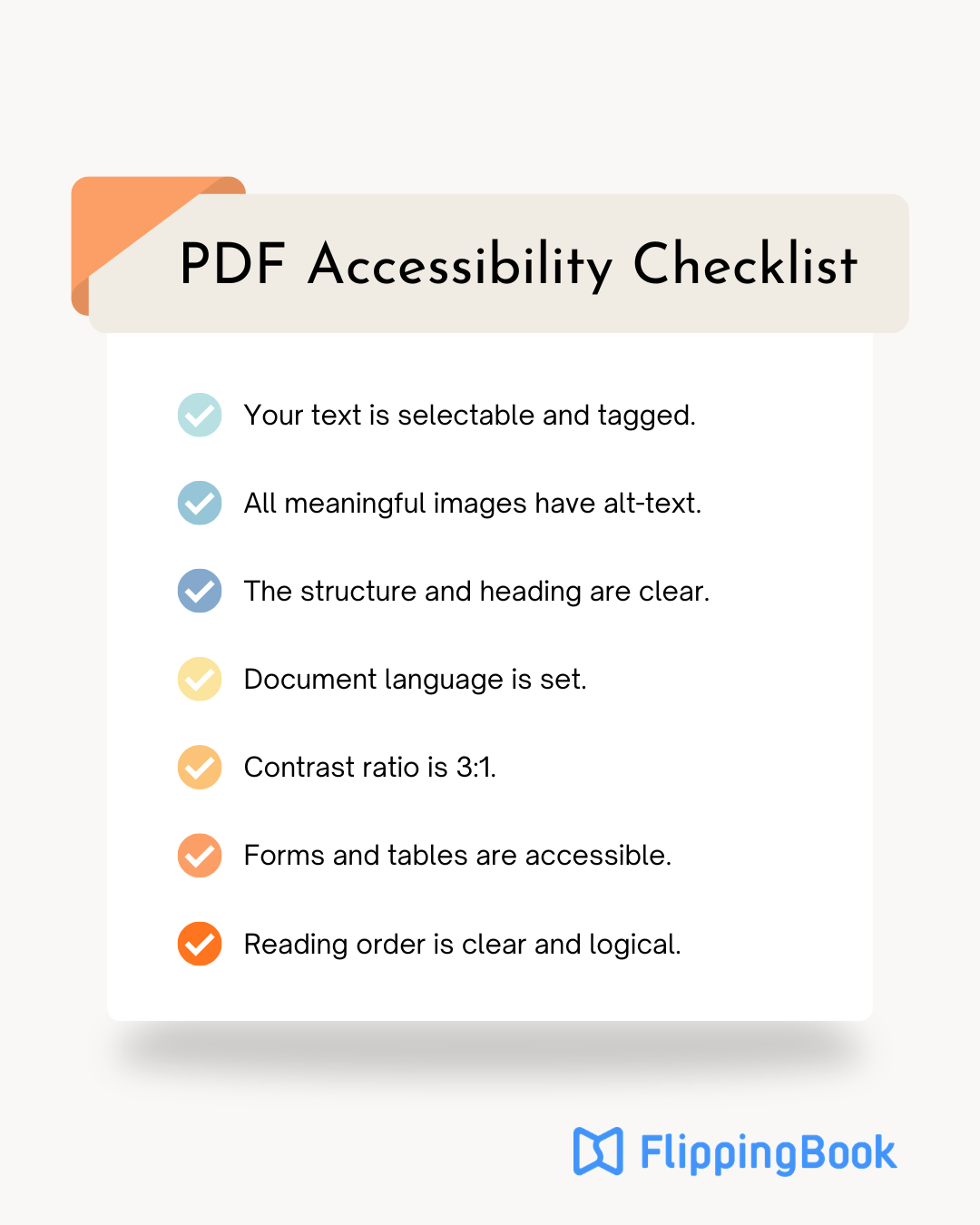
Step-by-Step PDF Accessibility Checklist
Here’s a short reminder to help you make any future PDFs compliant with WCAG and fully accessible to your readers.
Tools and Resources to Create an Accessible PDF
Creating accessible PDFs takes time and attention, but more importantly, it requires the right tools. There are free as well as paid options available, so let’s go over them.
PAC (PDF Accessibility Checker)
✅Main focus: PAC is free, AI-powered software that checks your PDF’s adherence to WCAG standards with a combination of machine and human checks. It’s an easy-to-use, reliable tool anyone can use.
❌Drawback: PAC is a desktop, Windows-based tool. If you’re primarily a Mac user, you’ll need a Windows-based computer or another tool.
Price: Free.
Microsoft Word’s built-in checker
✅Main focus: Microsoft Word lets you evaluate the accessibility of your Word document before you save it as a PDF. Its Accessibility Assistant will run your file against all the major accessibility criteria:
- Color and contrast
- Missing alt-text and media-related issues
- Tables structure and readability
- Document structure
This way, you’ll know if there are any issues and what exactly should be fixed.
❌Drawback: You can only create accessible PDFs with Microsoft Word if your source document is a Word file. This makes the tool not suitable for PDF remediation.
Price: Free (for a web version).
Adobe Acrobat Pro
✅Main focus: As the original developer of the PDF format, Adobe provides comprehensive tools for both creating and remediating accessible PDF documents. It enables you to structure and tag content, add navigation elements such as bookmarks, and include alternative text for images—covering all key accessibility requirements.
On top of that, the tool provides:
- Automated accessibility workflows. With the “Prepare for Accessibility” function, you can auto-tag documents, identify common issues, and receive prompts to set metadata like document title and language.
- Accessibility checker. Evaluates compliance with standards such as WCAG and PDF/UA.
❌Drawback: While powerful, accessibility remediation in Acrobat can be time-consuming and requires significant manual work, especially for complex documents.
Price: from $14.99/month.
CommonLook PDF
✅Main focus: CommonLook is a specialized tool focused entirely on PDF accessibility and compliance. Unlike general PDF editors, it is designed specifically for remediation workflows and is widely used in enterprise and government environments.
It provides precise PDF remediation with:
- Guided remediation workflows. Step-by-step tools walk users through fixing accessibility issues in a structured way.
- Standards-based validation. Built-in checks aligned with WCAG and PDF/UA, with actionable feedback.
- Tagging control. Advanced editing of tags, reading order, tables, and complex document structures.
- Compliance reporting. Generates detailed reports for auditing and documentation purposes.
❌Drawback: The tool has a steep learning curve and high cost, making it less accessible for small teams or occasional users.
Price: Custom.
axesPDF for Word
✅Main focus: axesPDF is a plugin for Microsoft Word that focuses on creating accessible PDFs at the source, rather than remediating them afterward. It’s especially useful for teams that want to plan for accessibility from the start.
Key features include:
- Accessible PDF creation from Word. Converts properly structured Word documents into PDF/UA-compliant PDFs.
- Validation during authoring. Identifies accessibility issues in Word before export.
- Template-based workflows. Helps enforce consistent, accessible document structures across teams.
- Standards compliance. Supports PDF/UA and WCAG-aligned output.
❌Drawback: It is limited to Word, so it’s not suitable for remediating existing PDFs or documents created in other tools.
Price: $650/year.
PDF Accessibility FAQ
- What is the difference between WCAG 2.1 and WCAG 2.2 for PDFs?
WCAG 2.2 builds on 2.1 with additional success criteria, especially around navigation, input help, and users with cognitive disabilities. For PDFs, this means clearer labeling of form fields, better focus order, and improved error suggestions. Meeting WCAG 2.2 helps future-proof your documents. - How much time does it take to remediate an inaccessible PDF?
A simple, text-based PDF may take 1–3 hours to remediate. Complex documents with tables, forms, and multimedia can take several days. The time depends on document length, structure, and whether you have access to the original source files. - Can I make a PDF accessible without the source file?
Yes, but it’s more complex. You’ll need to use OCR to recognize text in scanned files, manually tag structure, add alt text, and set the correct reading order. Without a source file, expect higher effort and potential limitations in achieving full compliance. - Which tools are best for checking PDF accessibility?
Free options include PAC (PDF Accessibility Checker) and WAVE. Paid tools like Adobe Acrobat Pro, CommonLook, and axesPDF provide more advanced remediation and validation features. The best choice depends on your budget and the complexity of your documents. - How often should I test and update PDF accessibility?
Test all new PDFs before publishing. Re-test older files if standards update (e.g., moving from WCAG 2.1 to 2.2) or if you update branding/design. Accessibility should be treated as an ongoing process, not a one-time fix. - What are the business benefits of accessible PDFs?
Accessible PDFs reduce legal risk, expand your potential audience, and improve user satisfaction. They also support DEI and ESG goals, enhance brand reputation, and, in some cases, improve search engine and AI/LLM visibility. Accessibility is both a compliance requirement and a business advantage.
Want to Make Your PDFs Accessible and Interactive?
Accessibility ensures your PDFs reach a wider audience. Interactivity, design, and smooth navigation are what make people engage with them.
FlippingBook helps you present PDFs in a fresh, engaging way—while keeping them accessible. Turn brochures, proposals, and newsletters into interactive digital experiences like this one: