Embedded publication appearance
In this article, we describe what your publications will look like when you embed them on your webpage. Basically, there are three different modes:
- The Interactive publication, including all menus, icons, and side windows;
- An animated preview with page-flipping effects, but without the interface;
- A cover page, that when clicked upon opens the full publication.
Which version shows up depends on three factors: the settings that you used for the embed code, the available window size, and whether you use a desktop or mobile device.
Interactive publication
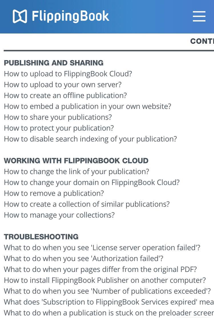
Here you see an example of our product guide as a full publication. If you view it on a desktop, you can use all the menu options, side windows, and functions.
FlippingBook Publisher - Product Guide
Animated preview
Here you see an example of our product guide as an animated preview. On desktops, you can flip the pages, but there is not enough room for the menus around the pages. When you click on the Click to Read box, the full publication is opened.
FlippingBook Publisher - Product Guide
Cover
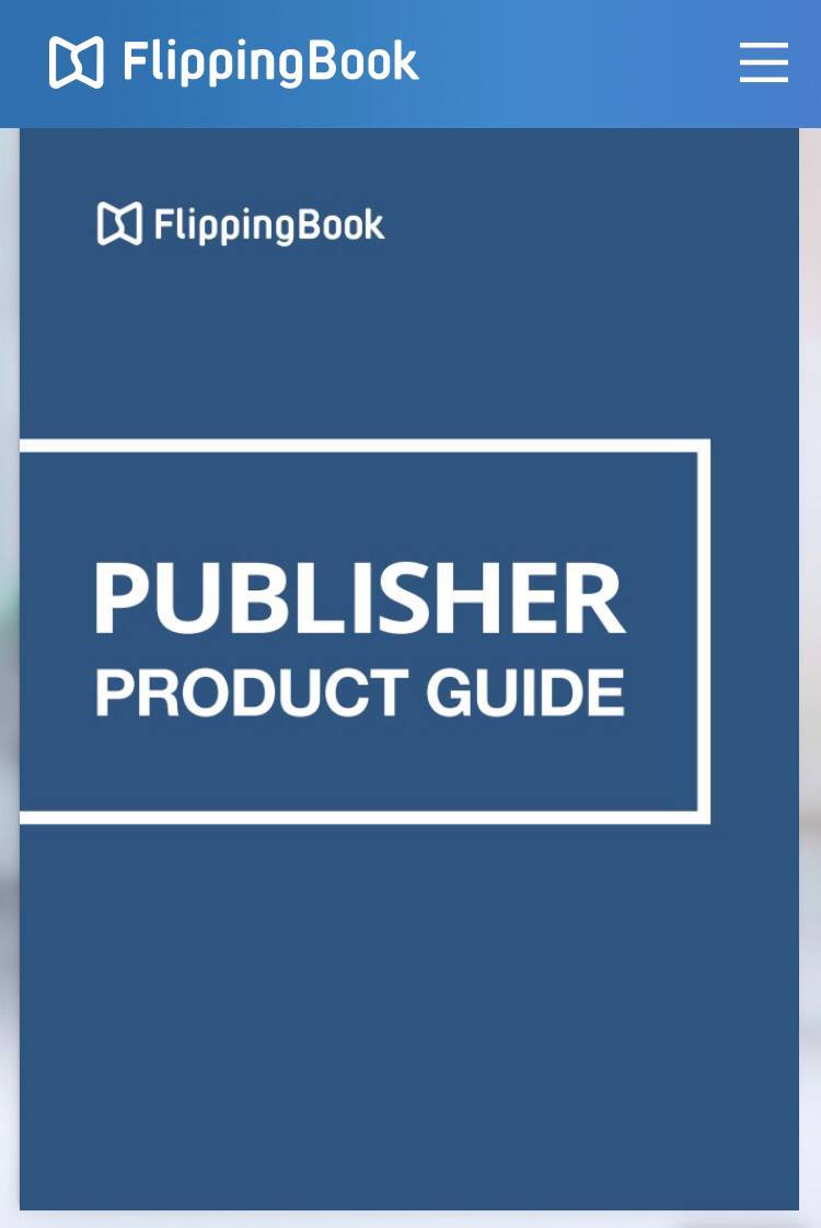
Here you see two examples of our product guide as clickable cover. When you click on the cover on the left-hand side, it will open in a pop-up window. The image on the right will open the publication in a new tab. You can specify this behavior in the embedding dialog.
| FlippingBook Publisher - Product Guide | FlippingBook Publisher - Product Guide |
Which version is shown?
Which of the three versions is shown depends on the settings that you used for the embed code, the available window size, and whether you use a desktop or mobile device. This is based on a rather complex set of rules, which are described in full below. But basically, we choose the most appropriate useful mode for your readers under all circumstances.
Appearance on desktops
If you open the page with your embedded publication on a desktop (PC or Mac), then:
- the interactive publication will be used if:
- you chose the Interactive option AND
- you specified a width of at least 550 pixels and a height of at least 300 pixels, AND
- the available space on your displayed page is at least 550 pixels wide and 300 pixels high.
- the animated preview will be used if:
- you chose the Interactive option AND
- the available space on your displayed page is between 400-550 pixels wide AND/OR between 200-300 pixels high
- the cover will be used if:
- you explicitly chose the option to use the cover OR
- you chose interactive publication but specified a width of less than 400 pixels or a height of less than 200 pixels OR the available space on your displayed page is less than 400 pixels wide or 200 pixels high.
Appearance on mobile devices
If you open the page with your embedded publication on a mobile device (tablet or smartphone), then:
- the animated preview will be used if:
- you chose the Interactive option AND
- you specified a width of at least 400 pixels and a height of at least 200 pixels, AND
- the available space on your displayed page is at least 400 pixels wide and at least 200 pixels high
- the cover will be used in all other situations.
Why is there no interactive publication on mobile devices?
We have chosen to not show an interactive publication on mobiles devices because the publication itself reacts to gestures (like swiping). This means that it is easily possible that the whole screen can be occupied by the publication. When that happens, there is no way for the user to scroll up and down to see the other content on your page. This leads to a very poor user experience.
Other than that, the screen size on especially smartphone makes pretty much all publications unreadable anyway when viewed on anything less than full screen. Hence we have chosen for the solution to open embedded publications in a new full-sized tab under all circumstances.
 |
 |
|
| At first sight, an embedded interactive publication looks fine on mobile. | But when we zoom in a bit and the publication fills the whole screen, your reader is stuck. |